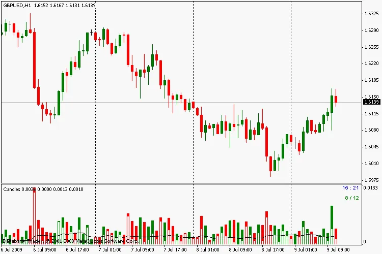
When you're diving into candle charts, the histogram is a key player. It illustrates the height of the candle, including both its shadows and the body (with the body usually shown in white). To smooth things out, we apply a moving average (MA) to the body’s height. In the top right corner, you’ll find the countdown timer until the candle closes, along with the ratio of bullish to bearish candles over a specified period (green text indicates more bullish bars, while red denotes more bearish).
Quick Tip: I initially aimed to tie the bullish/bearish ratio to the start of a specific period, like the beginning of the day or the day’s high/low. I’m still figuring this out, so if anyone has suggestions, I’m all ears! This is my first attempt at creating an indicator, and I’ve pieced the code together as best as I could.


Comments 0