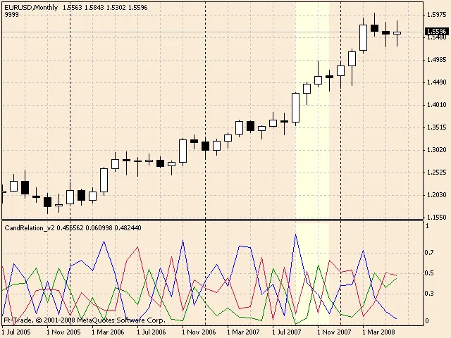
Candlestick patterns are a crucial aspect of trading, and understanding their components can significantly improve your analysis. Let’s break down what each part of a candlestick represents.
The Blue Line: This line represents the total length of the candle. It gives you a visual of the price movement within a specific timeframe.
The Green Line: This denotes the upper shadow of the candle. It illustrates the highest price reached during the period, highlighting potential resistance levels.
The Red Line: Conversely, this line signifies the lower shadow of the candle, showing the lowest price during that timeframe, which can indicate support levels.
By analyzing the future correlations between these lines with the corresponding figures from Japanese candlestick analysis, traders can gain insights into potential market movements. The pointed region on the chart is where these correlations come into play.
- Understanding the full range of a candlestick is key to effective trading.
- Identifying upper and lower shadows helps in recognizing market psychology.
- Utilizing these insights can refine your trading strategy.
Happy trading!


Comments 0