When diving into technical analysis, two indicators that often come up are the MACD and RSI. Let's break them down in a way that's easy to digest.
The Green Line: RSI
The green line on your chart represents the Relative Strength Index (RSI). This nifty tool helps traders identify whether a currency pair is overbought or oversold. Generally, an RSI above 70 indicates overbought conditions, while below 30 signals an oversold market. Keep an eye on it to gauge potential price reversals!
The Red and Gray Lines: MACD
The red and gray lines are part of the Moving Average Convergence Divergence (MACD) setup. The red line is the MACD histogram, which shows the difference between two moving averages. Meanwhile, the gray line is the signal line, acting as a trigger for buy and sell signals. When the MACD histogram crosses above the signal line, it’s often seen as a bullish signal, and vice versa for bearish signals.
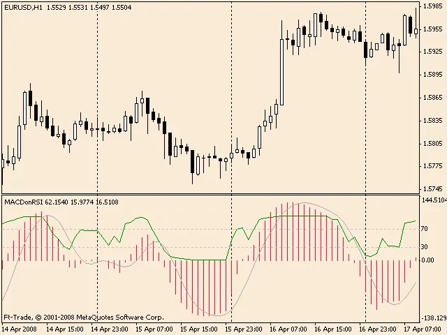
By combining the insights from both the RSI and MACD, you can get a clearer picture of market trends and make more informed trading decisions. Happy trading!


Comments 0