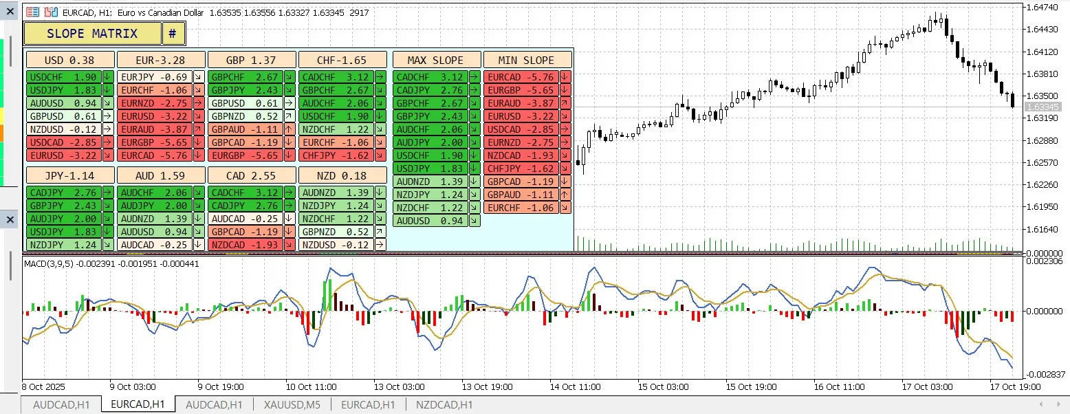
1. What is the MACD Histogram?
The MACD Histogram (also known as MACD-H) is the bar chart component of the MACD indicator. It visually represents the difference between the MACD line and the Signal line. In simple terms, the formula looks like this: MACD Histogram = MACD Line - Signal Line.
2. What Does It Mean?
The MACD Histogram is all about measuring the momentum of a trend. It helps traders gauge whether a trend is picking up speed or slowing down.
- Bars getting longer & above the zero line: This indicates that buying momentum is gaining strength.
- Bars getting longer & below the zero line: This suggests that selling momentum is on the rise.
- Bars getting shorter: A sign that momentum is weakening, which could signal a potential trend reversal or consolidation.
- Bars crossing the zero line: This is the crossover point where the MACD line meets the Signal line.
Final Thoughts: While the MACD Histogram is an excellent tool for filtering signals, it’s wise to use it alongside other indicators and trend analysis for the best results.


Comments 0