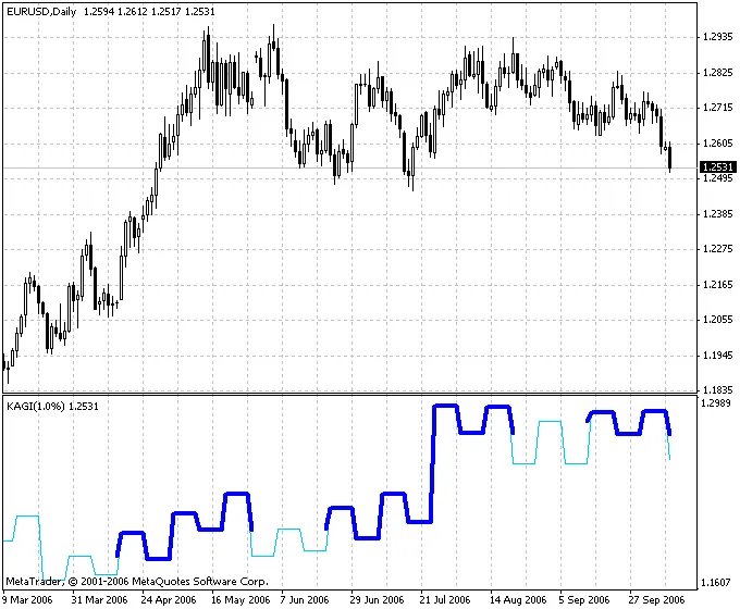
Kagi Charts have their roots in the 1970s during the early days of the Japanese stock market. These charts are unique in that they consist of a series of interconnected vertical lines, with their thickness and direction determined solely by price movements, rather than time.
When prices move consistently in one direction, the vertical line on the chart extends longer. However, if the price reverses by a predetermined value (known as the reverse coefficient), a new vertical line will be drawn in a new column. The thickness of the Kagi lines adjusts when prices break through previous highs or lows.
Kagi Charts gained popularity in the U.S. largely thanks to Steve Nison’s influential book, Beyond Candlesticks.
These charts are excellent at illustrating the tug-of-war between supply and demand. A series of thick lines indicates that demand is outpacing supply, signaling a bullish market. Conversely, a series of thin lines suggests that supply exceeds demand, indicating a bearish trend. When thick and thin lines alternate, it reflects a market in balance.
The primary trading signal derived from Kagi Charts relates to line thickness: if a thin line turns thick, it’s a signal to buy; if a thick line turns thin, it’s time to sell. Additionally, if you observe a series of rising highs and lows, it reflects a strong upward trend, while decreasing highs and lows indicate a weakening market.
Parameters:- Porog - reversing coefficient in percentages


Comments 0