Welcome back, fellow traders! Today, we’re diving into the fascinating world of Point & Figure (P&F) charts. These charts are a bit different from the standard price charts you’re used to, as they focus solely on price movements and completely ignore time.
What Are Point & Figure Charts?
Unlike traditional charts that plot time on the X-axis and price on the Y-axis, P&F charts display price changes on both axes. This unique approach allows traders to see the market's movements without the noise of time.
Understanding the X's and O's
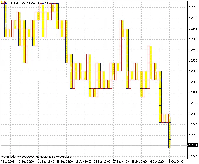
In P&F charts, you’ll notice two symbols: “X” and “O”. The “X” (represented by a red mark) indicates price increases by a specific value known as the RazmBox. Conversely, the “O” (shown as a yellow mark) signifies price decreases by the same value. If the price changes by an amount less than this RazmBox, neither Xs nor Os will be plotted.
Columns and Trends
Each column on a P&F chart can only contain either Xs or Os, but not both. To transition between columns (for instance, from a column of Xs to a column of Os), the price must shift by a specified amount in the opposite direction. This change in columns reflects a shift in the market trend.
Customizing Your Chart
If you're looking to hide the price chart for a cleaner look, you can adjust the background color in the chart window settings. Just head to the “Properties” menu in the chart window, click on the “Colors” tab, and modify the fields for “Bar Up,” “Bar Down,” “Bull Candle,” “Bear Candle,” and “Line.”
Key Parameter
- RazmBox: This is the base value used to determine the increments for Xs and Os.
There you have it, folks! Point & Figure charts can be a powerful tool in your trading arsenal. By focusing on price movements and ignoring time, you can gain a clearer view of market trends. Happy trading!


Comments 0