Understanding Historical Levels is crucial for any trader looking to gain an edge in the market. These levels represent price points that have been significant over the history of a trading symbol, often acting as barriers that prices struggle to break through. From a financial perspective, these levels highlight key economic conditions that influence the trading environment of a specific symbol. Research suggests that prices often respect these historical levels, only breaking through them when a substantial shift in market conditions occurs. This makes Historical Levels an invaluable tool for traders aiming to enhance their market analysis.
In my journey as a trader, I’ve developed a framework for analyzing these levels through the lens of candlestick formations. How price interacts with these levels can have a profound impact on candle shapes. For instance, when a price approaches a strong historical level, we often see a PRICE JUMP due to the significant volume of trades piled up at that price point or nearby.
To effectively utilize this concept, I’ve established two essential rules:
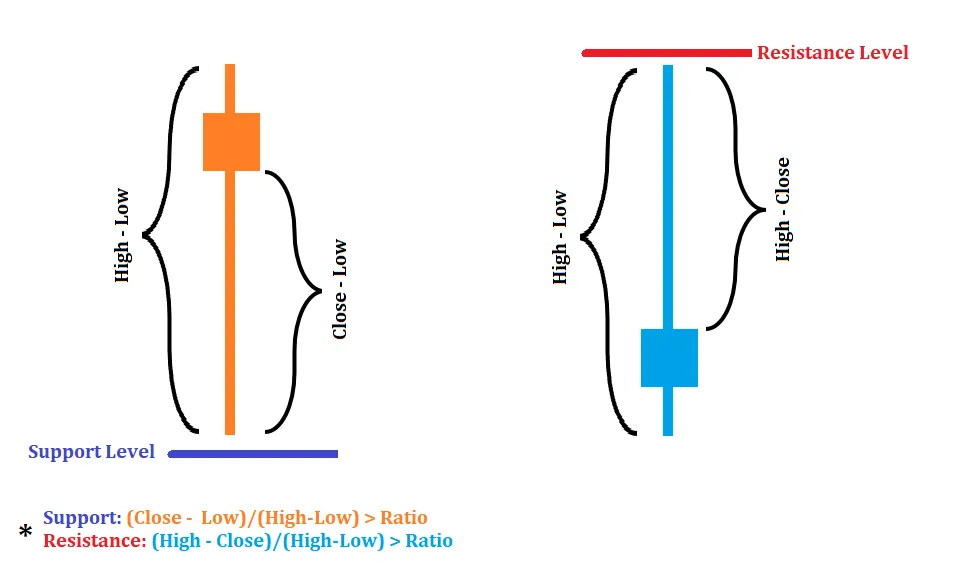
- Rule 1 (Bullish candle at a support level): If the close - low > Jump Factor
- Rule 2 (Bullish candle at a resistance level): If close - low > Jump Factor & (close - low) / (high - low) > ratio
To clarify these rules, I’ve included two images below:

Image 1: Jumping from Support/Resistance levels with a bullish candle on support.

Image 2: Jumping from Support/Resistance levels with a bullish candle under resistance.
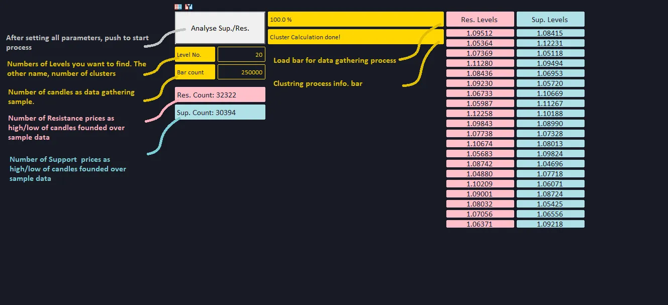
Based on these rules— which can be tailored to your strategy—I developed an indicator that compiles data into two different matrices (sup_mat and res_mat). This indicator displays the number of Support and Resistance levels that adhere to the selected criteria while gathering data. To optimize this process, I utilized the AlgLib (dataanalysis.mqh) library to perform a clustering analysis using the K-means method. The results are presented as columns of Support and Resistance Levels data.
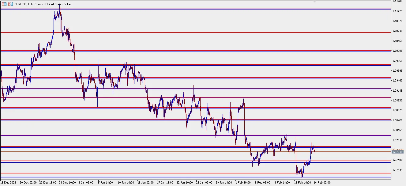
Once the levels are established, the indicator opens a chart with the analyzed symbol and overlays all identified levels (clusters) based on the clustering process. To ensure it’s user-friendly, various parameters can be adjusted directly from the screen. Here’s a snapshot of the indicator’s interface and its results:

Image 3: Indicator interface.

Image 4: Automatic plotting of levels on the chart.
In conclusion, this tool proves to be extremely powerful, even with just a couple of straightforward rules in place. The levels it identifies exhibit strong support and resistance characteristics. There’s also room to expand its functionality—additional rules can be added, and the code is designed to be adaptable for further improvements. Future enhancements may include refining clustering areas, exploring maximum distances before retouching levels, and much more. If you’re interested in diving deeper, feel free to reach out!

Comments 0